Page 1 of 3
Small text font (see example)

Posted:
Wed Aug 12, 2009 9:58 pmby BlueSalamander
Dear gamers,
I wanted to ask two things:
1) Since we're going to redraw the main text font in a higher resolution, would it be worth redrawing the small text font used in the help pages as well?
2) it has been proposed to switch the cursor from pointing towards the bottom-left to pointing towards top-left, is everyone happy with that?
Re: Small text font
Posted:
Wed Aug 12, 2009 10:15 pmby Pod
1) You'd have to make a test and see, I suppose. I find the current text fine.
2) The most obvious solution for the user is to put a small coloured dot where the cursor position is.
Re: Small text font
Posted:
Wed Aug 12, 2009 10:16 pmby Gendal
1) The small text font isn't nearly as unreadable as the main text font. Still, an upgrade wouldn't go amiss.
2) Works for me. Just having it being consistent would be nice.
Re: Small text font
Posted:
Wed Aug 12, 2009 10:26 pmby Demiath
1) Not absolutely necessary. Then again, maybe the sheer smallness of the help menu text is an issue for users with large LCD monitors?
2) I like it just the way it is, actually.
Re: Small text font
Posted:
Wed Aug 12, 2009 11:32 pmby Over
1) I think it's not worth it. For that size, I don't know how much improvement can be done. It's nice as it is (assuming that it can't be in a higher resolution than the game itself).
2) I'm not opposed to that, although I prefer as it is. Maybe I just got used to it.
Re: Small text font
Posted:
Thu Aug 13, 2009 1:37 amby getter77
1. Improve what you can, with samples just to confirm folk haven't gone blind or some such.
2. Sure, though a colorful dot would also be swell I suppose.
Re: Small text font
Posted:
Thu Aug 13, 2009 2:18 amby xalles
1) I run the game in windowed mode at 960x720 on a 1680x1050 desktop on a 22" monitor, and both fonts are very readable. I suppose the smaller font is more readable than the larger, and thus probably less can be gained from changing it.
2) Top-left pointer corresponds with the windows mouse cursor, so that seems like a good plan.
Re: Small text font
Posted:
Thu Aug 13, 2009 12:03 pmby Lurking Grue
1) I'd like both fonts to be redrawn. I play on windowed mode, using the smaller window option and the help file font is a tad too small for my taste. Not being very versatile in d20/OGL rules, I need to read a lot of those files and there can be quite large amounts of text in some entries and that's when the font "offends" me most. I'd go with a serif font, because it is more readable in large amounts than a sans-serif font. At least, IMO. The main font is something I've bugged you about before, but believe it or not, I've gotten used to it now whilst playing the game, and it doesn't bother me that much any more. Having said that, I wouldn't mind a more readable font and judging from the posts at Codex and Watch, there are many who cannot stand it. (Maybe you could provide samples of the new fonts before implementing them, so we can better judge if we want the change or not.)
2) YES, for all that holy and good, yes! Pretty please with sugar on top, change it to point UP, not down. If nothing else, make it an option you can choose, the original cursor or the new top-pointing cursor. Pleeez.
Re: Small text font
Posted:
Fri Aug 14, 2009 9:24 amby Paul.Illes
I would like to know what 'redraw means'? I guess resolution of the game won't be changed, so redrawing means you're going to aim a more readable font in same resolution.
So the question is, how readable you find those smaller fonts. I think both fonts can be made better readable, tho' i have no big problems with reading it in fullscreen mode, but i guess in windowed mode it might be a problem. (Tho' i like its being classic right now!) I guess the problem will be that you have to make it a very low resolution font again to. Or you would have to create different sets of fonts for the doubled/tripled resolution windowed mode.
well after all:
1, Yes, make it more readable the smaller fonts if you can

and keep the classic feeling
2, Indifferent, i like the cursors
Re: Small text font
Posted:
Fri Aug 14, 2009 1:24 pmby BlueSalamander
Okay as an example here is this:
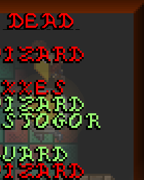
At the top, you can see the text font in triple resolution. This is possible in windowed mode 960x720. In full screen mode, it will be double resolution instead.
So, is a "smoothing" of the font sufficient? Or do you think the font's style needs to be changed too?