Page 2 of 3

Re: Small text font

PostPosted: Fri Aug 14, 2009 1:34 pm
by Demiath
My guess is that the people who really don't like the font take issue with both its resolution and its style. The only thing which bothers me personally is the TABLOIDESQUE CAPITAL LETTER FUNDAMENTALISM.

Re: Small text font

PostPosted: Fri Aug 14, 2009 3:54 pm
by WCG
BlueSalamander wrote:So, is a "smoothing" of the font sufficient? Or do you think the font's style needs to be changed too?


Smoothing the font looks good to me. I think that would do it.

Re: Small text font (see example)

PostPosted: Fri Aug 14, 2009 4:27 pm
by skavenhorde
I'm reading about the silly font all over the place. To me it's fine just the way it is. It must be because I still replay the goldbox games and FRUA, but it really isn't that hard to read.

Re: Small text font (see example)

PostPosted: Fri Aug 14, 2009 4:47 pm
by Pod
I think the major problem people have is the serifness of it. A larger version of the help font would do fine, I imagine?

Re: Small text font

PostPosted: Fri Aug 14, 2009 6:20 pm
by Over
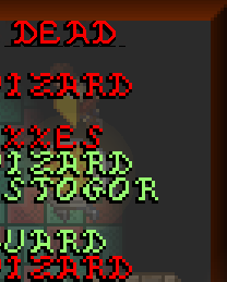
BlueSalamander wrote:Okay as an example here is this:

At the top, you can see the text font in triple resolution. This is possible in windowed mode 960x720. In full screen mode, it will be double resolution instead.

So, is a "smoothing" of the font sufficient? Or do you think the font's style needs to be changed too?


Looks better like this.

BTW, do you still have the font you've used in earlier screenshots? Would it be possible to allow players to select the font they wanted in the main menu?

Re: Small text font (see example)

PostPosted: Fri Aug 14, 2009 6:42 pm
by BlueSalamander
The blocky font I was using before is copyrighted, I think.

Re: Small text font (see example)

PostPosted: Fri Aug 14, 2009 10:56 pm
by Emanresu
The serifs of the font, the similar looking shapes of the letters, and ALL CAPITALS gives me eyestrain when I try to read that text. I had the same problem when trying to play Darklands recently.

I'm pretty much in the same boat as this guy in that this game would be an instant purchase as soon as the font issue is resolved. You might consider looking at some digital typography tips and such...on computer screens, sans-serif fonts tend to be more legible and easier on the eyes.

Anyways, thanks for responding to the feedback on this and seriously looking into this issue. Hope to play the full game soon.

Re: Small text font (see example)

PostPosted: Fri Aug 14, 2009 11:06 pm
by BlueSalamander
I will tell the artist to have a look at that site and to remove some of the "serifness"... Adding lower case characters would be a lot of trouble though. Hopefully that won't be necessary.

Re: Small text font (see example)

PostPosted: Sat Aug 15, 2009 2:35 am
by xalles
I never had much trouble reading the current font, but the high-res version does look better I think. The font in this video is super easy to read. I swear I've seen that video's font in another game before...

Re: Small text font (see example)

PostPosted: Sat Aug 15, 2009 3:05 pm
by getter77
The new DEAD is definitely a step in the right direction if nothing else, but yeah people do tend to flip out at all caps as well.