[Discussion Topic] The new v1.05 Inventory UI, yea or nay?
6 posts
• Page 1 of 1
[Discussion Topic] The new v1.05 Inventory UI, yea or nay?
![]() by bluehinter » Sun Aug 30, 2020 12:18 am
by bluehinter » Sun Aug 30, 2020 12:18 am
Pierre wanted feedback on the new icon based inventory screen. So let's discuss.
-

bluehinter - Vrock (CR 9)
- Knights of the Chalice 2
- Kickstarter Knight
- Posts: 37
- Joined: Thu Jul 02, 2020 8:34 pm
- Location: Sacramento
Re: [Discussion Topic] The new v1.05 Inventory UI, yea or na
![]() by bluehinter » Sun Aug 30, 2020 12:28 am
by bluehinter » Sun Aug 30, 2020 12:28 am
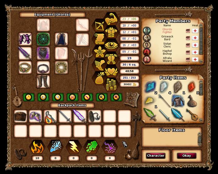
My opinion: The elemental icons at the bottom are fine, but the hex icons on the top right are too confusing. At the very least, they need to be small enough that they can line up directly next to their numerical values. Ideally, they should also have the standard STR, INT, CON, etc. abbreviations next to them, but if the goal is to try to cut down on translation costs, maybe a compromise would be to give them (and the numeric values) roll-over text with the common English stat abbreviations, which just about anybody who has ever played a RPG is probably going to recognize, even if English isn't their primary language.
I also have to say, thanks for tweaking the containers so that they stay open when you select them so it's easier to drag items in and out, but we still need the chest inventory tweaked so that it will show if a weapon/spell scroll is usable, while it's in the container. After all, you don't forget whether or not you can use a mace just because it's in a bag. Even better, would be if it did this while showing the Party Inventory and Floor Items as well.
Additionally, Spell scroll management also needs to be tweaked since the inventory UI doesn't distinguish between spells you can eventually learn (because it's currently too high a level for you) and spells you can cast from, but will never be able to learn. (Meaning that you should probably sell it or pass it to another character unless it's so valuable that it's worth taking up an entire inventory slot for a one-off hail-mary throw.)
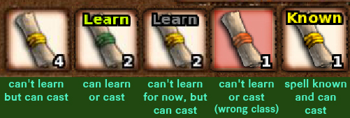
Most of this confusion here could be eliminated if spells that you can eventually learn, but don't have the correct level for yet, were simply marked with a greyed out "Learn." (see example below)
Ideally, right-clicking on a spell scroll should also show more useful information in the Item Details section, like the spell's base level, what classes can learn from the scroll, which classes can cast from the scroll, the spell's domain (ex: Evocation) and the descriptive text that you would normally see on the help page for that spell (or a link to that spell in the help screen). However, if this can't be done due to the way items are handled (where somehow the spell scroll description can't be changed to reflect individual items) then at the very least, the spell scroll name field should be appended to include the spell class(es) and base level so we don't have to guess.
Personally, I would suggest rejigging the inventory screen, and relocating the range weapon/range ammo slots, and Fire, Cold, Shock, Acid, Sonic resistances so that bag/chest row(s) can be displayed as a permanent 3rd row, and won't automatically close as soon as you drag an item out of them.
If you have multiple bags/chests, it should either toggle views when you click on another container item, or turn into a scroll window to allow as many rows as you have bags. This would be ideal, since it would allow you to transfer items directly between containers without having to drop to the floor or go: bag, inventory, inventory, other bag for every item you want to move.
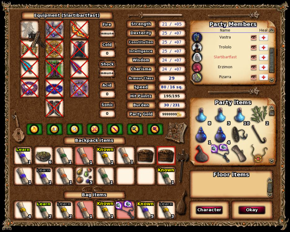
Here's a photoshopped version of how I think the inventory screen should look:
I also have to say, thanks for tweaking the containers so that they stay open when you select them so it's easier to drag items in and out, but we still need the chest inventory tweaked so that it will show if a weapon/spell scroll is usable, while it's in the container. After all, you don't forget whether or not you can use a mace just because it's in a bag. Even better, would be if it did this while showing the Party Inventory and Floor Items as well.
Additionally, Spell scroll management also needs to be tweaked since the inventory UI doesn't distinguish between spells you can eventually learn (because it's currently too high a level for you) and spells you can cast from, but will never be able to learn. (Meaning that you should probably sell it or pass it to another character unless it's so valuable that it's worth taking up an entire inventory slot for a one-off hail-mary throw.)
Most of this confusion here could be eliminated if spells that you can eventually learn, but don't have the correct level for yet, were simply marked with a greyed out "Learn." (see example below)
Ideally, right-clicking on a spell scroll should also show more useful information in the Item Details section, like the spell's base level, what classes can learn from the scroll, which classes can cast from the scroll, the spell's domain (ex: Evocation) and the descriptive text that you would normally see on the help page for that spell (or a link to that spell in the help screen). However, if this can't be done due to the way items are handled (where somehow the spell scroll description can't be changed to reflect individual items) then at the very least, the spell scroll name field should be appended to include the spell class(es) and base level so we don't have to guess.
Personally, I would suggest rejigging the inventory screen, and relocating the range weapon/range ammo slots, and Fire, Cold, Shock, Acid, Sonic resistances so that bag/chest row(s) can be displayed as a permanent 3rd row, and won't automatically close as soon as you drag an item out of them.
If you have multiple bags/chests, it should either toggle views when you click on another container item, or turn into a scroll window to allow as many rows as you have bags. This would be ideal, since it would allow you to transfer items directly between containers without having to drop to the floor or go: bag, inventory, inventory, other bag for every item you want to move.
Here's a photoshopped version of how I think the inventory screen should look:
-
bluehinter - Vrock (CR 9)
- Knights of the Chalice 2
- Kickstarter Knight
- Posts: 37
- Joined: Thu Jul 02, 2020 8:34 pm
- Location: Sacramento
Re: [Discussion Topic] The new v1.05 Inventory UI, yea or na
![]() by Atoch » Sun Aug 30, 2020 10:30 am
by Atoch » Sun Aug 30, 2020 10:30 am
I don't like the new icons. I really don't like them.
But most important
Why would you compromise the whole design of the UI and mixing different styles?
It's not that the new icons are ugly or done poorly - they are just not fitting. Imho.
- -They are to big
- - Some of them are not easily recognisable
But most important
- - They represent a totally different art style!
Why would you compromise the whole design of the UI and mixing different styles?
It's not that the new icons are ugly or done poorly - they are just not fitting. Imho.
- Atoch
- Umber Hulk (CR 14)
- Knights of the Chalice
- Posts: 85
- Joined: Fri Nov 24, 2017 11:32 am
Re: [Discussion Topic] The new v1.05 Inventory UI, yea or na
![]() by jms123 » Mon Aug 31, 2020 12:17 am
by jms123 » Mon Aug 31, 2020 12:17 am
Agree, don't like them and feel they are a step backwards for the following reasons (already mentioned by others):
- They are too big so they don't align and make it harder to read rather than easier
- There is not necessarily a natural/automatic/obvious meaning in relation to the actual stat, I mean I guess strength is obvious but not all of them are so clear (eye? flower?)
- Multiple suggestions have been provided on this forum for improvements to the UI that could take advantage of additional real-estate, so using that real estate for large icons is not the best choice IMO.
- If icons are going to be included, they should probably still show the text, e.g. inside of them or next to them, different people have different preferences for how they pick up on visual cues vs. text
- HP should just be a plain red heart, no wings/leaves (or whatever those things are underneath it)
- Carry weight should probably be a scale
- The gold icon is redundant because there is already a smaller, better looking, one next to the numerical value on the right of the text field. Actually, using that approach for all of the stats isn't a bad idea.
- Sonic is a bit odd/off, I think it just needs the sound waves, not the streak/blast part
- For reasons already discussed, If kept, they should be much smaller.
- haven't tried it in game (finished and not going back at the moment), but if there are no tooltips, that is needed at a minimum
- jms123
- Planetar (CR 16)
- Knights of the Chalice
- Knights of the Chalice 2
- Kickstarter Knight
- Posts: 104
- Joined: Wed Mar 31, 2010 10:47 pm
Re: [Discussion Topic] The new v1.05 Inventory UI, yea or na
![]() by LordSith » Mon Aug 31, 2020 6:02 pm
by LordSith » Mon Aug 31, 2020 6:02 pm
didn't play yet but seeing the screenshot, i already know i don't like them. Not fitting, not bringing anything useful.
The comment by bluehinter is way more interesting regarding ui.
The comment by bluehinter is way more interesting regarding ui.
OS: windows 10, 64bits, family edition.
Playing KOTC steam version since march 2022.
Playing KOTC steam version since march 2022.
- LordSith
- Silver Wyrm (CR 24)
- Posts: 287
- Joined: Thu Jul 02, 2020 5:53 pm
Re: [Discussion Topic] The new v1.05 Inventory UI, yea or na
![]() by BlueSalamander » Wed Mar 03, 2021 10:09 pm
by BlueSalamander » Wed Mar 03, 2021 10:09 pm
Thank you for the feedback everyone! Well, I can have a graphic artist do some new icons for the inventory screen so that we can have something that looks better and more fitting. I'm going to have to hire one or two graphic designers in any case just for the hand-drawn story images, combat-action icons, new adventure maps, and additional tokens and sprites. Probably not going to happen before the Steam release though, as there are more important things for me to finish first, and searching for an artist will slow me down too much. Cheers 
'Say there is a chunk of meat. Pirates will have a banquet and eat it! But heroes will share it with other people. I want all the meat!!' - Luffy in One Piece
-

BlueSalamander - Master Conjuror
- Posts: 1905
- Joined: Sun May 18, 2008 6:20 pm
6 posts
• Page 1 of 1
Return to About the KotC 2 Augury of Chaos cRPG
Who is online
Users browsing this forum: No registered users and 8 guests